Relaxound
2025
eCommerce
Logo Design / Branding / Animation / Video production
As a full-time Graphic Designer within the eCommerce team at Relaxound GmbH, my responsibilities encompassed a wide range of visual content creation. I specialized in producing engaging social media posts, static and video advertisements, and comprehensive newsletters, among other design collateral.
I’d like to highlight a significant cross-functional rebranding project I spearheaded. This initiative aimed to refresh the company’s visual identity, which had remained unchanged for over a decade. It presented a unique opportunity to modernize the brand’s aesthetic. My initial steps involved identifying core brand values and aspirations to inform the creation of a contemporary, clean, and fitting brand identity. Unfortunately, this promising project was curtailed due to the company’s unforeseen financial difficulties.

To strengthen the brand identity and lead the logo redesign, I began with a tonality assessment that identified two primary characteristic groups: Naturality ![]() and Seriousness
and Seriousness ![]() (Competence, Quality, Timelessness, and Clarity).
(Competence, Quality, Timelessness, and Clarity).
Drawing inspiration from both heritage brands (IBM, Mercedes-Benz) and organic pioneers (Oatly, Ecosia), we developed a balanced visual language. Reliability is expressed through geometric serifs and a monochrome/navy palette, while Naturality utilizes organic forms, earth tones, and humanist typography.
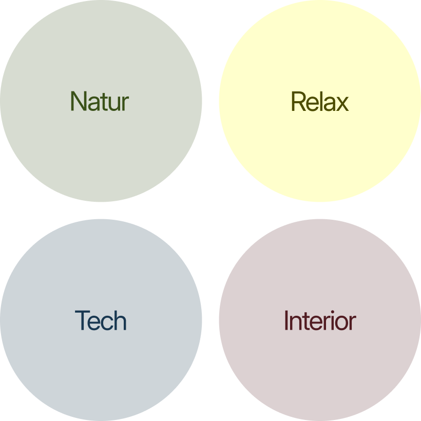
This strategic framework was then applied across four product categories to ensure brand consistency:
![]() Organic marks, earth tones, and humanist typefaces.
Organic marks, earth tones, and humanist typefaces.
![]() Soft, approachable aesthetics promoting tranquility.
Soft, approachable aesthetics promoting tranquility.
![]() Geometric minimalism in blue and monochrome for precision.
Geometric minimalism in blue and monochrome for precision.
![]() Elegant wordmarks pairing pastels with serif/sans-serif contrast.
Elegant wordmarks pairing pastels with serif/sans-serif contrast.
To communicate the product’s unique positioning, we synthesized the research findings into a singular design equation. By merging the „N“ (Naturality) and „S“ (Seriousness/Reliability) attributes, the visual identity becomes a bridge between technology and Nature.
Brand
The final visual identity is a strategic synthesis of these elements, designed to communicate the product’s dual nature as both a high-end electronic device and a wellness object. The foundation is rooted in the „N“ (Naturality) dimension through the use of earth tones, such as sage greens and muted terracottas, which ground the brand in the Natur and Interieur markets by replacing a clinical electronic feel with the warmth of a home sanctuary. This is balanced by the Geometric Sans-Serif typography representing the „S“ (Seriousness) dimension, which signals the product’s Tech foundations and communicates the precision, durability, and competence of the device. Acting as the harmonious centerpiece, the organic minimalist logo serves as the ultimate point of convergence; its minimalist aesthetic reflects high-end essentialism, while its organic forms ensure the brand remains approachable and calm, speaking directly to the Relax and Natur categories.
Motifs

Iteration
Final version
Organic + Minimalist
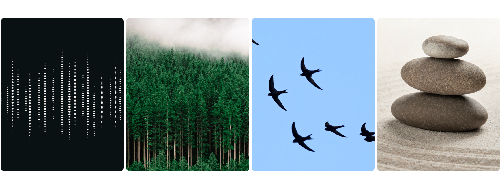
Bird + Sound + Plant + Sun
Natural Color Scheme
This natural color palette, „Dusk,“ captures the tranquil essence of twilight and earth, blending the deep indigo of „Dusk“ and the rich green of „Moss“ for a calm, grounded feel. These are elegantly contrasted by the warm, soft tan of „Dune“, reminiscent of sun-baked landscapes. A vibrant, fiery orange-red „Blaze“ serves as a striking accent, symbolizing the last embers of sunset. Together, these colors evoke a harmonious balance of nightfall’s quiet introspection, nature’s enduring vitality, and vivid moments of intensity.
Dusk
HEX: #25253d
RGB: (37, 37, 61)
HSL: (240°, 24%, 19%)
CMYK: (39%, 39%, 0%, 76%)
Moss
HEX: #253d2f
RGB: (37, 61, 47)
HSL: (145%, 24%, 19%)
CMYK: (39%, 0%, 23%, 76%)
Dune
HEX: #FFED00
RGB: (255, 237, 0)
HSL: (56°, 100%, 50%)
CMYK: (0%, 7%, 100%, 0%)
Blaze
HEX: #FFED00
RGB: (255, 237, 0)
HSL: (56°, 100%, 50%)
CMYK: (0%, 7%, 100%, 0%)
Primary Brand Font
Poppins, a geometric sans-serif typeface, creates a perfect bridge between natural themes and technology when paired with the color palette. Its geometric foundation lends it a clean, precise, and modern aesthetic, aligning seamlessly with the structured and efficient nature of technology. The absence of serifs provides a streamlined, digital-friendly appearance, enhancing readability on screens.
Despite its modern feel, Poppins possesses an underlying calmness and clarity. This „calm“ quality, combined with its business-appropriate and versatile nature, ensures that the technological interface feels approachable and unintrusive.