DUS–TING Studios
2025/2026
Collaboration Case Study
Logo Design • Branding • Animation • Video production • Webdesign
This self-initiated strategic challenge serves as a comprehensive conceptual model for a specialised production studio designed to bridge the gap between the academic study of the humanities and high-end digital media. The result recognized for its viability as a top-30 finalist out of 200 entries in the BPW Business Plan Competition graded with a „gut bis sehr gut“ the project goes far beyond a simple design exercise, establishing a rigorous framework for translating abstract thought into immersive audiovisual content.
The concept addresses a significant shortcoming in the e-learning sector: humanities explainer videos that are both visually attractive and scientifically correct. Rather than merely reciting facts, the model aims to facilitate a transformative „wow moment“ — or Anstoß — by utilising a „Mystery“ narrative style. This transforms the viewer from a passive student into an active detective, maintaining high engagement through a visually uncanny atmosphere and the suspense of discovery. This approach was developed by my significant other, my big Other, Aycan Bozkir, who advised me on all matters of theory and philosophy.
The design challenge was to present seemingly dull and outdated topics and fields of research in a way that preserved their tradition and scientific rigor—while using a mysterious atmosphere and innovative design to spark interest and make them more accessible.
Buisness model
This hypothetical business model is based on the typical model used by YouTube creators. With a bimonthly video release schedule, professional support, and a visually appealing presentation, it generates attention to build a community and generate revenue through advertising, Patreon, and merchandising.
Mission
Entertaining and accurate education in the humanities for a broad audience.
Vision
A culture of reflection for a broad audience, aimed at promoting democracy.
Purpose
Empowering a broad audience to think more critically—outside of college or school.
The Challange
How can one rebrand supposedly “dusty” topics in a way that makes them relevant, contemporary, and appealing to a broad audience?
The challenge was to create a brand for subjects that are often perceived as „dusty,“ academic, and inaccessible, and transform them into something relevant and compelling for a broad audience. How do you make philosophy, history, and other humanities topics feel contemporary and exciting without sacrificing their intellectual depth? How do you build curiosity around ideas that many people assume are not meant for them?
How do you honor the tradition of these subjects, do not betray them and make ideas of Plato feel as urgent, radical, relevant and contemporay as they actually are to this day?
The Sollution
The solution was to position the humanities not as relics of the past, but as artifacts of a „future-past“ by combining classical elements with a design language associated with the future: chrome textures, rivival fonts, bitmaps and 3D graphics.
Rather than softening or oversimplifying complex ideas, the brand reframed them as intellectually stimulating experiences that invite curiosity, mystery, and tinge of the uncanny.
The result was not simply a visual identity, but a coherent ecosystem consisting of brand strategy, audience personas, market analysis, content strategy, product concepts, and applications across digital touchpoints. The project demonstrated how branding can reshape perception: transforming subjects often dismissed as „dusty“ into experiences that feel desirable, culturally relevant, and worth engaging with.
Logo
The brand’s visual anchor is a stylized Attic vase that functions both as a historical artifact and as an image rich in meaning, and which resonates deeply in various philosophical texts, such as those of Heidegger where he takes about a vase as an example of what he calls „das Ding“. Drawing on Sophocles’ “Antigone,” the vessel symbolizes the ritual objects used in her defiant burial rite—an ethical decision analyzed by many thinkers from Hegel to Lacan. Although the motif is rooted in classical antiquity, its execution is modern: the bitmap graphic gives it a retro-futuristic touch.


Fonts
The typographic identity is based on a ‚Baroque-digital‘ tension, reflecting our belief that historical enquiry can be used as a contemporary tool. We utilise Epicene Display/Text (modified), which are modern interpretations of Baroque letterforms. With its sharp serifs and dramatic contrast, Epicene conveys a sense of ‚historical grandeur‘ and academic authority. This is interrupted by MD Thermochrome, a pixel-inspired sans serif font. The brand visually articulates the dialectical process of finding the answer within the question and the modern within the ancient by pairing the opulent, flowing lines of the 17th century with the calculated, bitmap logic of the digital age.
Epicene Collection
Epicene Collection
Kilm Type Foundry
MD Thermochrome
MD Thermochrome
Mass Driver
Color Scheme
The brand’s visual language is defined by a high-contrast colour palette designed to present intellectual discourse in a minimalist yet impactful way. The primary accent colour, Ostrakon (#FA1616), is inspired by the oxidised iron found on Athenian pottery. It is used strategically to inject a sense of revolutionary energy and urgency into key brand communications. This intensity is balanced by Melas (#171717), a subtle charcoal shade that adds weight and clarity to the typography, and Argós (#F1EDEA), a neutral grey that provides a structured backdrop. The Hyper-Gradient replaces static surface colours. This gradient represents the futuristic vision of metal, the stars, and space.
Melas
#080603
Ostrakon
#FA1616
Argós
#FA1616
#FA1616
Asteroeis
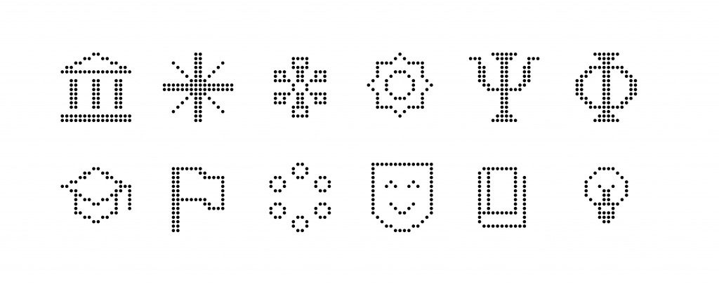
Icons
The icon system extends the core identity by translating classical motifs into a contemporary digital vocabulary. Constructed on the same underlying grid as the amphora logomark, each icon retains a shared geometric logic while referencing themes from philosophy, history, and the humanities. Their bitmap-inspired appearance evokes the aesthetics of early digital media, creating a deliberate tension between antiquity and technological modernity. In doing so, the icons function not merely as navigational elements, but as recognisable artefacts within the broader narrative universe of the brand.
Imagery
The visual language seeks to make the familiar unfamiliar. Drawing on classical iconography while reinterpreting it through contemporary digital aesthetics, metallic surfaces and stylised uncanny 3D objects to create a sense of mystery and contemporary edge. Rather than illustrating concepts literally, images communicate ideas as experiences: they provoke curiosity, establish atmosphere, and encourage viewers to actively investigate the ideas presented. In this way, the visual world itself becomes part of the learning experience, transforming the humanities from something perceived as distant and static into something immediate, strange, and compelling.