Verimi GmbH
2022-2024
ID Provider
Brand Development / Webldesgin / Print
Animation / Video production
In early 2022, I joined Verimi GmbH, a leading German digital identity provider, as a graphic designer. It quickly became apparent that the company’s existing branding did not align with its core values and lacked clarity. This misalignment led to inconsistent design decisions, complicating internal communications and weakening the brand’s external perception. To address this, I organized and led a cross-team workshop to develop a new corporate identity that reflects Verimi’s core values of simplicity, trustworthiness, and innovation, aligning with design, business, and marketing goals.
Brand Workshop
In late 2022, I led a cross-team workshop to tackle significant branding issues. We discovered that the existing branding was inconsistent, failed to convey core values, and lacked essential elements like templates and a dedicated display font. The website was also unclear and disorganized. The workshop focused on creating a comprehensive Corporate Identity (CI) that aligns with our design, business, and marketing strategies. The results outlined here stem from that workshop.
Brand Colors
Bright green is used for call-to-action buttons and key notifications, capturing attention and reflecting Verimi’s dynamic identity. Dark green, our primary brand color, appears in headers and major design elements, conveying reliability and professionalism. White serves as a background color, ensuring clarity and a modern, clean aesthetic.
Brand Font
The Suisse typeface, known for its clarity, modernity, and versatility, embodies Swiss design principles with a range of weights and styles. Its clean, professional look enhances readability and brand consistency, aligning with Verimi’s values of transparency, modernity, and precision in digital identity services.
Social Media
The grid template shown is designed for social media posts, particularly for square formats like Instagram and LinkedIn. It features five vertical columns and five horizontal rows for balanced content distribution. Ample margins and gutters ensure clear separation between sections, creating a clean, organized layout. Text aligns with the grid’s guidelines for consistent spacing, while images in the lower right quadrant and the Verimi logo in the top right corner enhance balance and brand visibility. This layout ensures uniformity, clarity, and professionalism, reinforcing brand identity effectively.
Blog
The grid template for blog posts features a versatile layout with seven vertical columns and ten horizontal rows, designed for long-format content. It provides ample space for detailed text and multiple images, with generous margins and gutters for a clean, organized look. Precise alignment of text and images ensures a professional appearance, while the flexible design allows for strategic image placement and effective branding, making it ideal for comprehensive and engaging blog content.
Webseite
As the graphic designer, I worked with the marketing team to modernize the Verimi website with a clean, minimalistic design. We replaced outdated stock photos with simple illustrations and real product images to enhance credibility. The redesign addresses previous issues with lengthy texts by emphasizing clarity and brevity, and user testing confirmed the new site effectively communicates our values and offers intuitive navigation.
Tutorials & Interviews
I developed explainer videos for Verimi, using engaging animations and phone mockups to clearly demonstrate products and align with the company’s identity. These videos simplify complex processes and boost user engagement. We also created expert interviews to provide technical insights, enhancing transparency and reinforcing brand credibility.


Illustrations
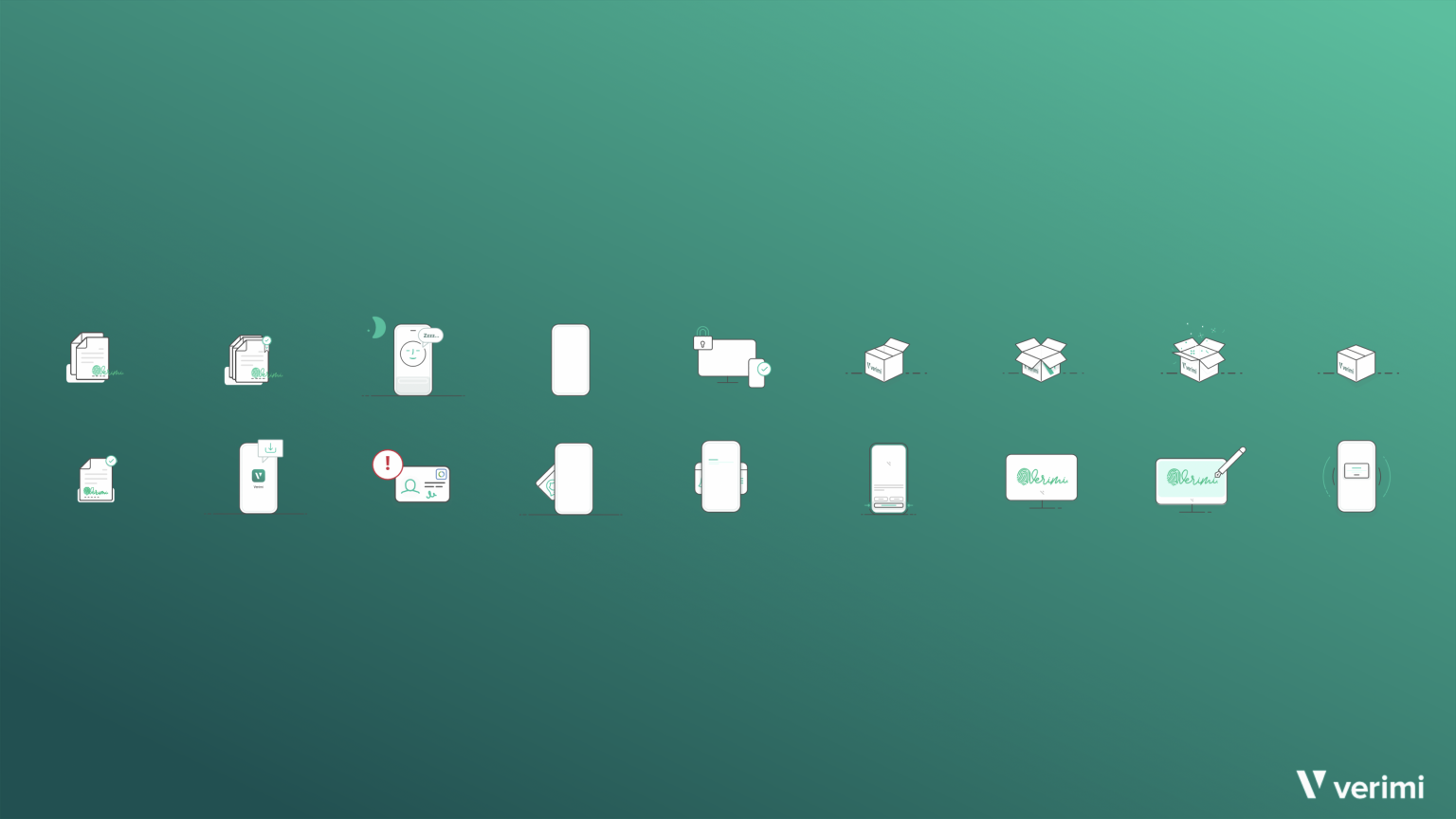
I designed a series of clear, simple illustrations for Verimi’s product pages to simplify complex identification products. This approach enhances accessibility and aligns with Verimi’s brand identity, adding a friendly touch to build a welcoming image.
Powerpoint Master
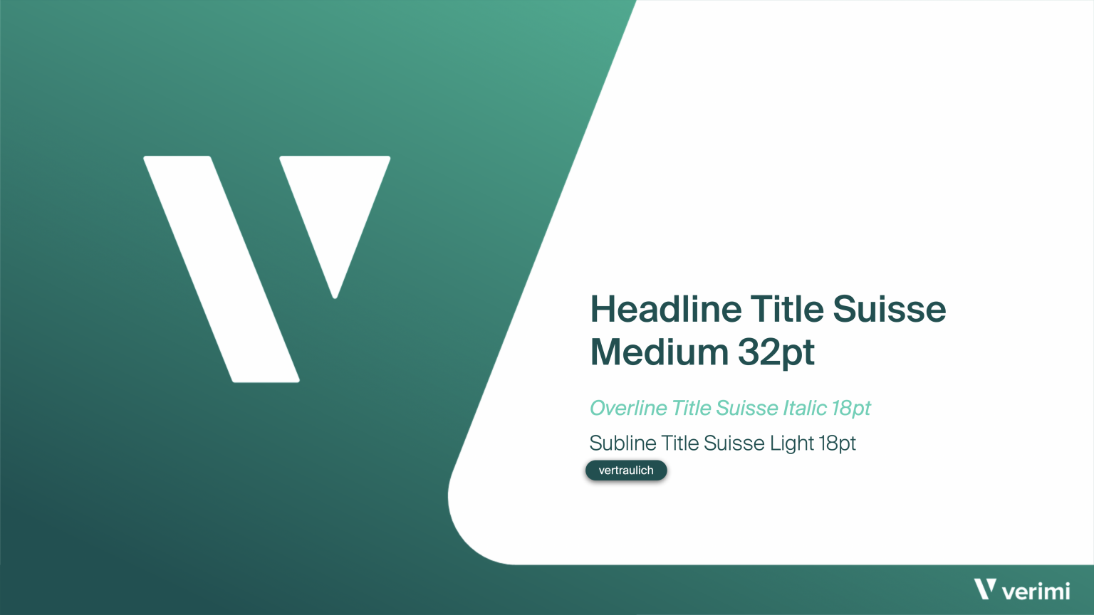
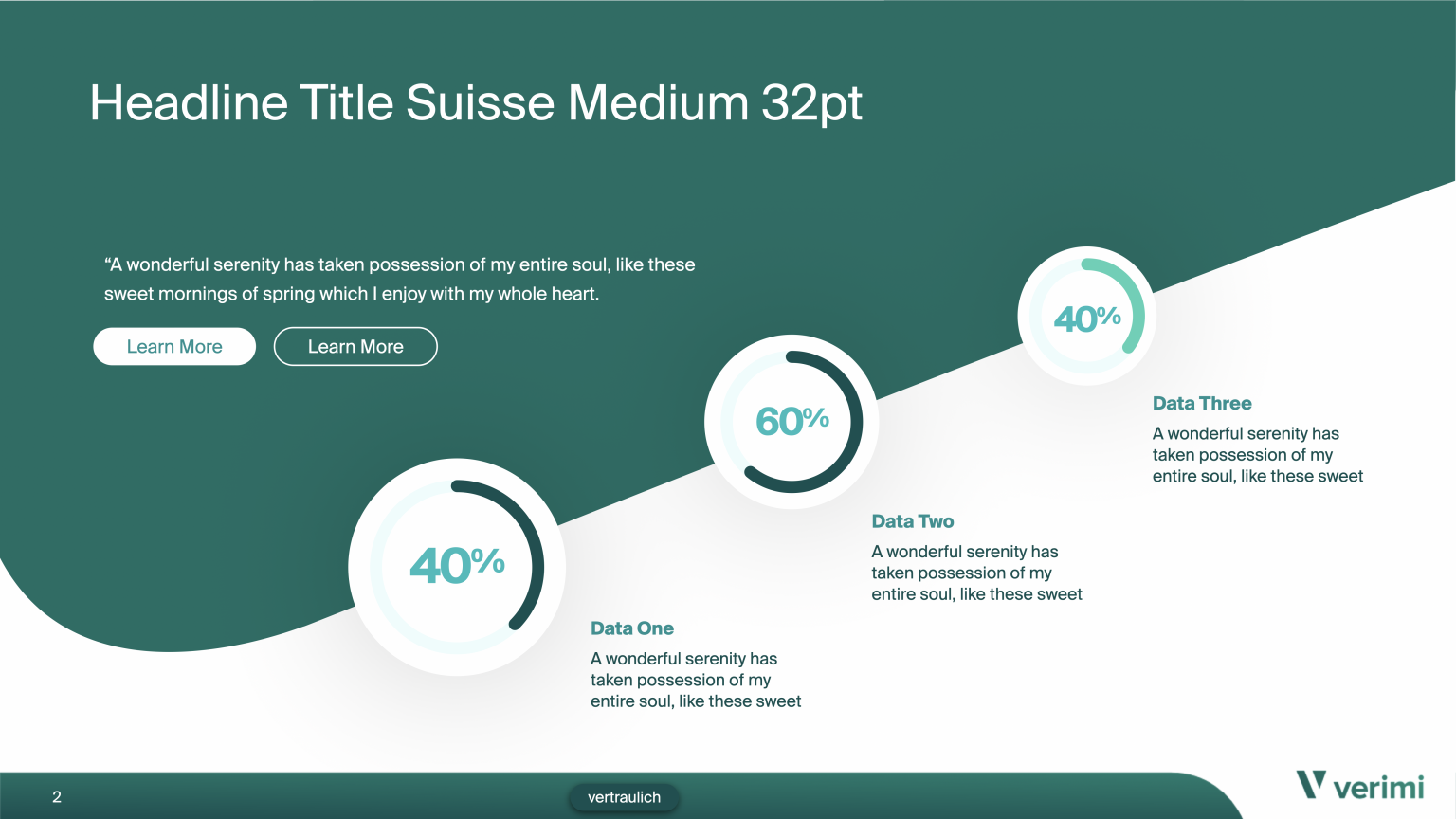
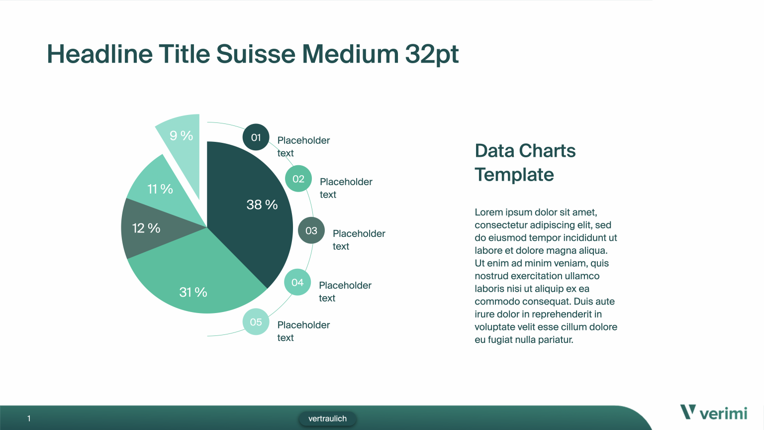
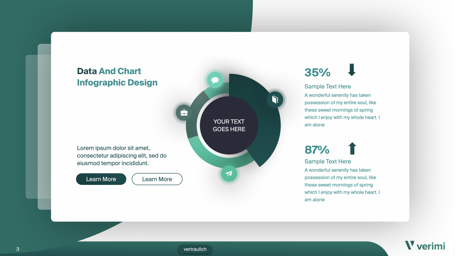
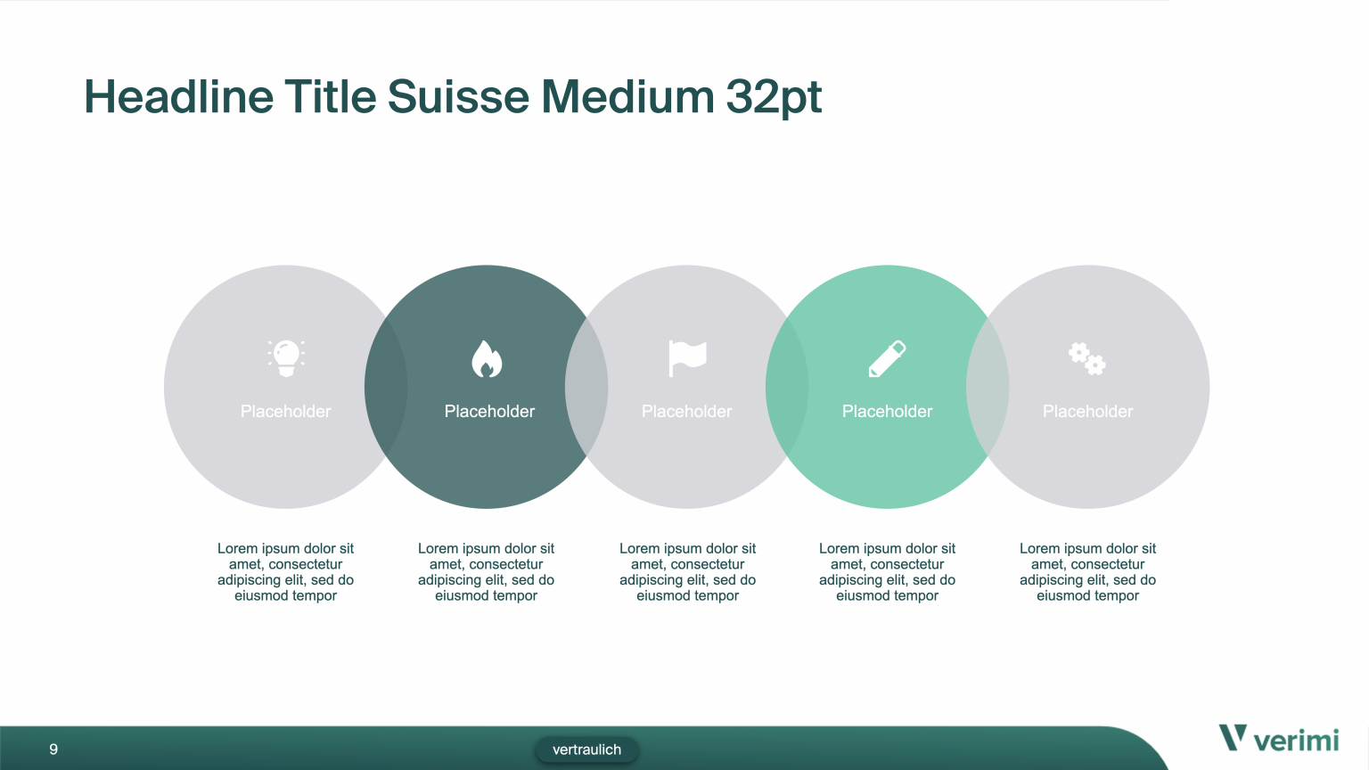
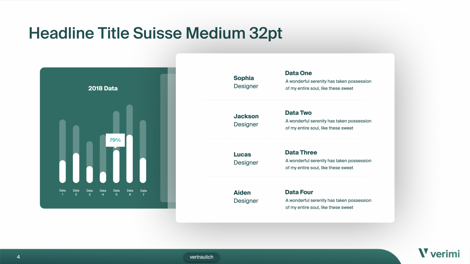
The Verimi PowerPoint master file provides a professional template to ensure consistent branding. It features the modern Suisse typeface, bright green highlights, dark green headers, and white backgrounds. Slides include the Verimi logo and titles in dark green, with a structured grid for balanced content and infographics for clear data presentation. The design uses simple illustrations, phone mockups, and icons, reinforcing Verimi’s modern and approachable image with a focus on simplicity and clarity.


Rollups & Messestände
The Verimi rollup banners, designed for conventions, feature phone mockups on a green gradient backdrop with an interconnected curved shape. They showcase Verimi’s B2B and B2C products, with concise white text and the white Verimi logo. This design highlights Verimi’s innovations, reinforcing brand identity and attracting attention.
Appstore Previews
One of my first projects for Verimi was creating App Store previews with clear illustrations to showcase key app functionalities. The previews include wallet screens, a dashboard overview, and visuals of features like the wallet and driver’s license, all presented in a consistent, user-friendly style that reinforces Verimi’s commitment to clarity.
